The Challenge
Project: ERU League Rebrand & Visual Identity
Client: Edmonton Rugby Union
Scope: Logo Design, Visual Identity, Brand Strategy, Apparel Design

The Solution
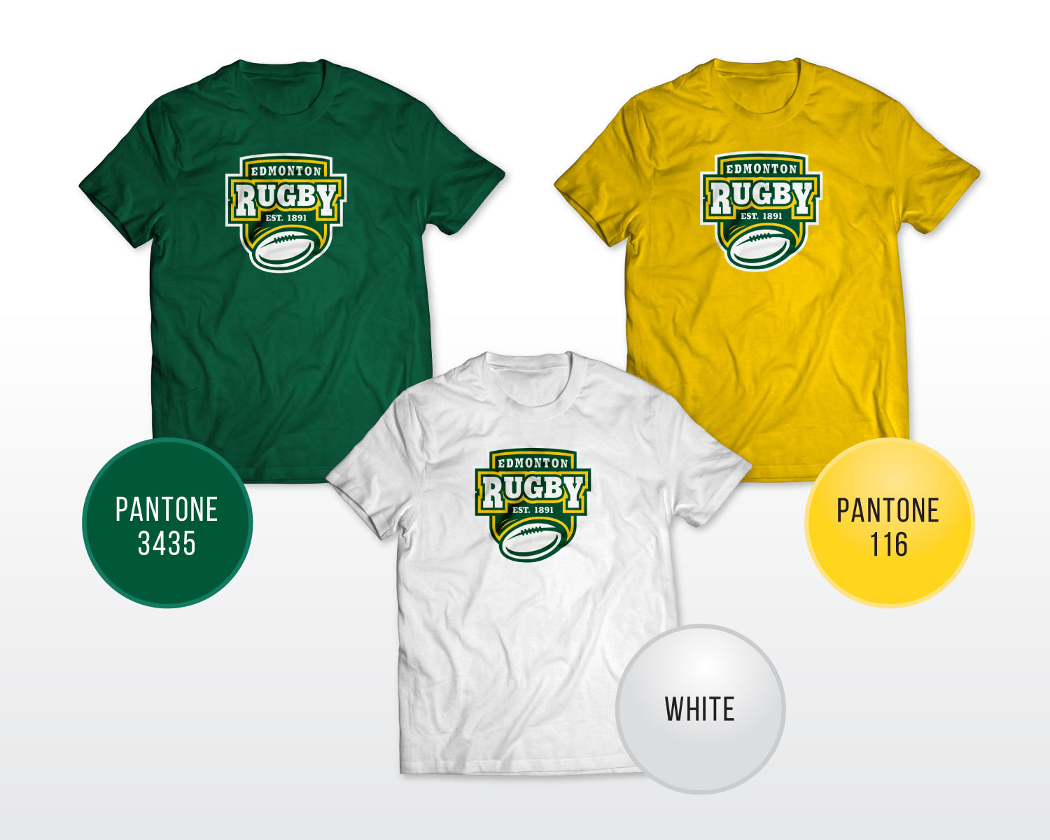
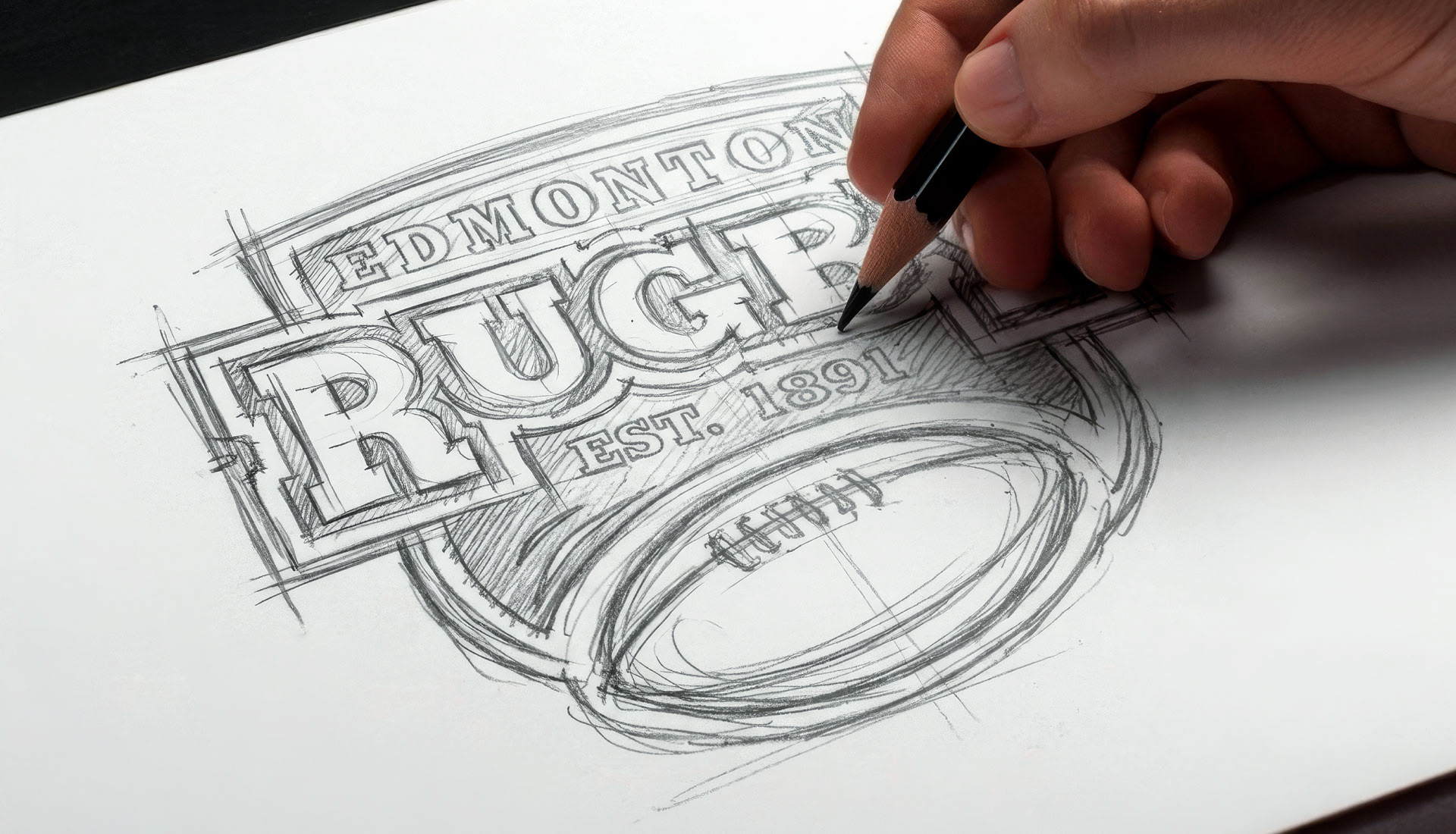
The solution establishes an enduring athletic crest engineered to command authority across 15 affiliated member clubs. By stripping away extraneous detail in favor of bold, kinetic geometry, the emblem bridges legacy with modern competitive prestige. A heritage palette of forest green, athletic gold, and crisp white grounds the union in Northern Alberta’s sporting roots, delivering maximum contrast and legibility.

The Execution
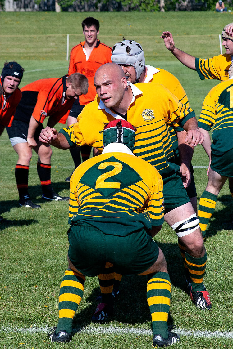
Optimized for high-wear athletic performance, the identity delivers immediate recognition and strong visual contrast across every jersey colorway, uniform, and piece of fan apparel.