The Challenge
Project: Power of the Word Brand Identity
Client: Power of the Word Evangelistic Association
Scope: Logo Design, Visual Identity, Brand Strategy, Art Direction, Environmental Design
The Solution
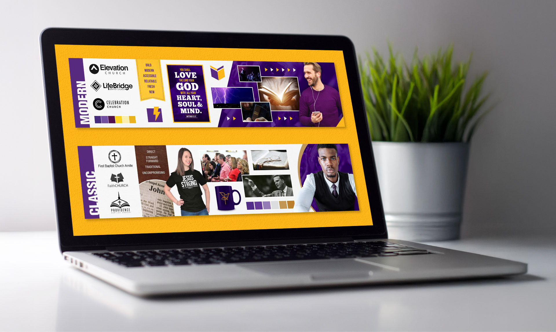
The solution translates the ministry’s spiritual mandate into a timeless, highly adaptable visual mark built for modern communication. Complementing the primary logo, a formal brand manual established strict parameters for color hierarchy and typography. This system served as the blueprint for every touchpoint.


The Execution
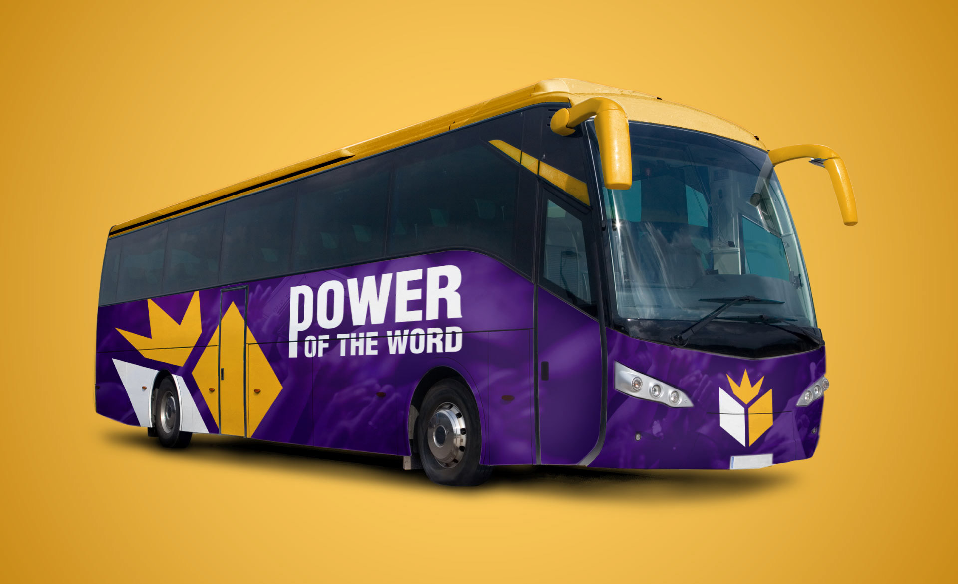
Designed as a responsive visual system, the identity scales effortlessly across diverse environments. The mark’s balanced geometric weight ensures optical clarity at any scale, preserving instant recognition.