

The Challenge
Project: Whirl Win!
Client: Pure Casino Edmonton
Scope: Creative Direction, Art Direction, Campaign Identity, Visual System

The Solution
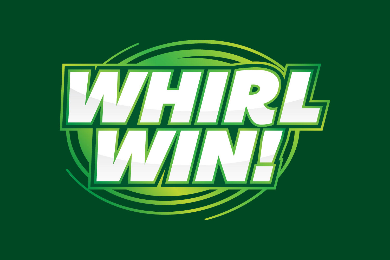
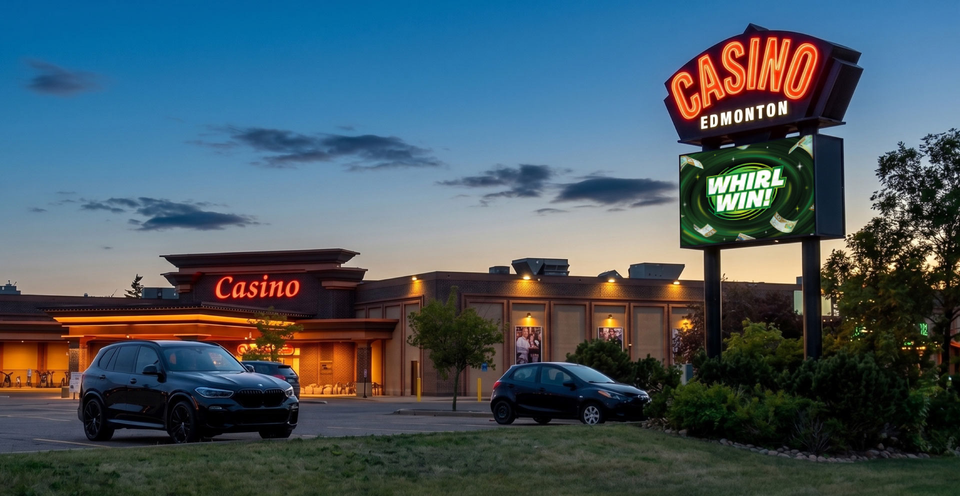
Anchored by a stylized cyclonic motif, the visual identity mirrors the aerodynamic rush of swirling cash inside the chamber. The system utilizes vibrant emerald and neon greens – symbolizing currency and instant-win energy – paired with bold, forward-leaning display typography. These kinetic curves and high-contrast color choices instantly telegraph velocity, luck, and high-stakes excitement.


The Execution
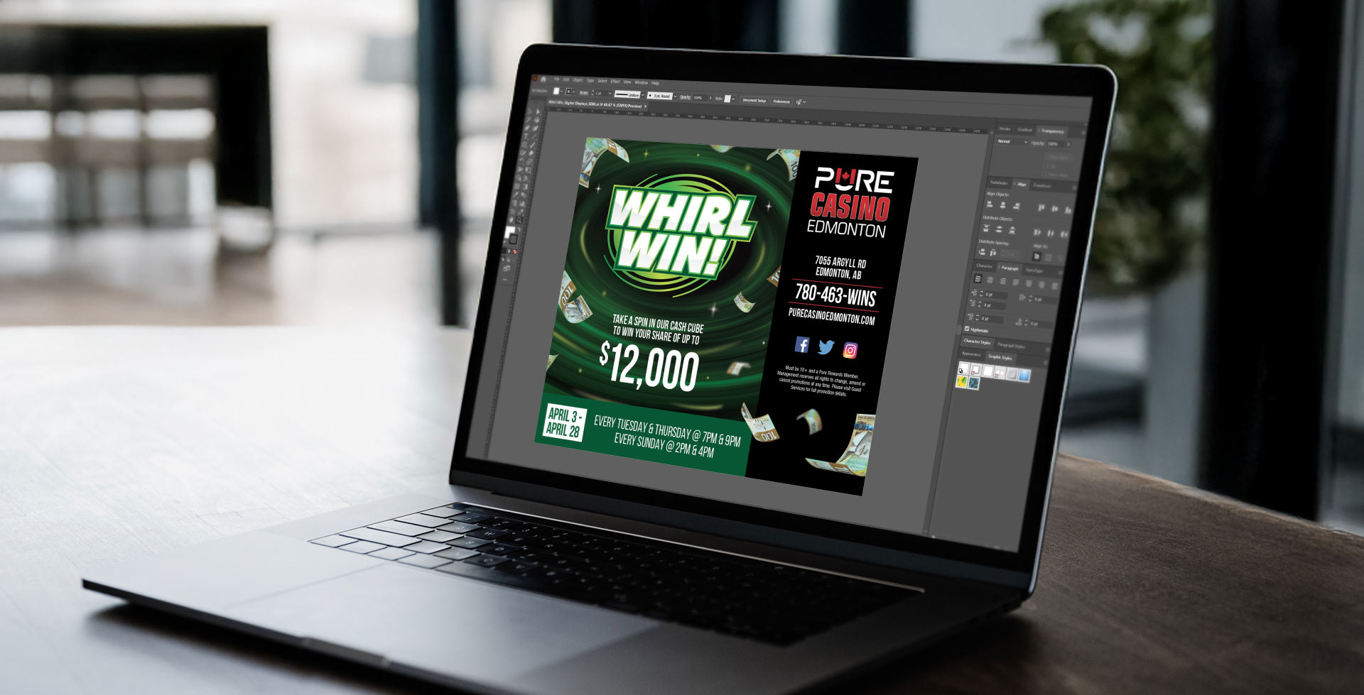
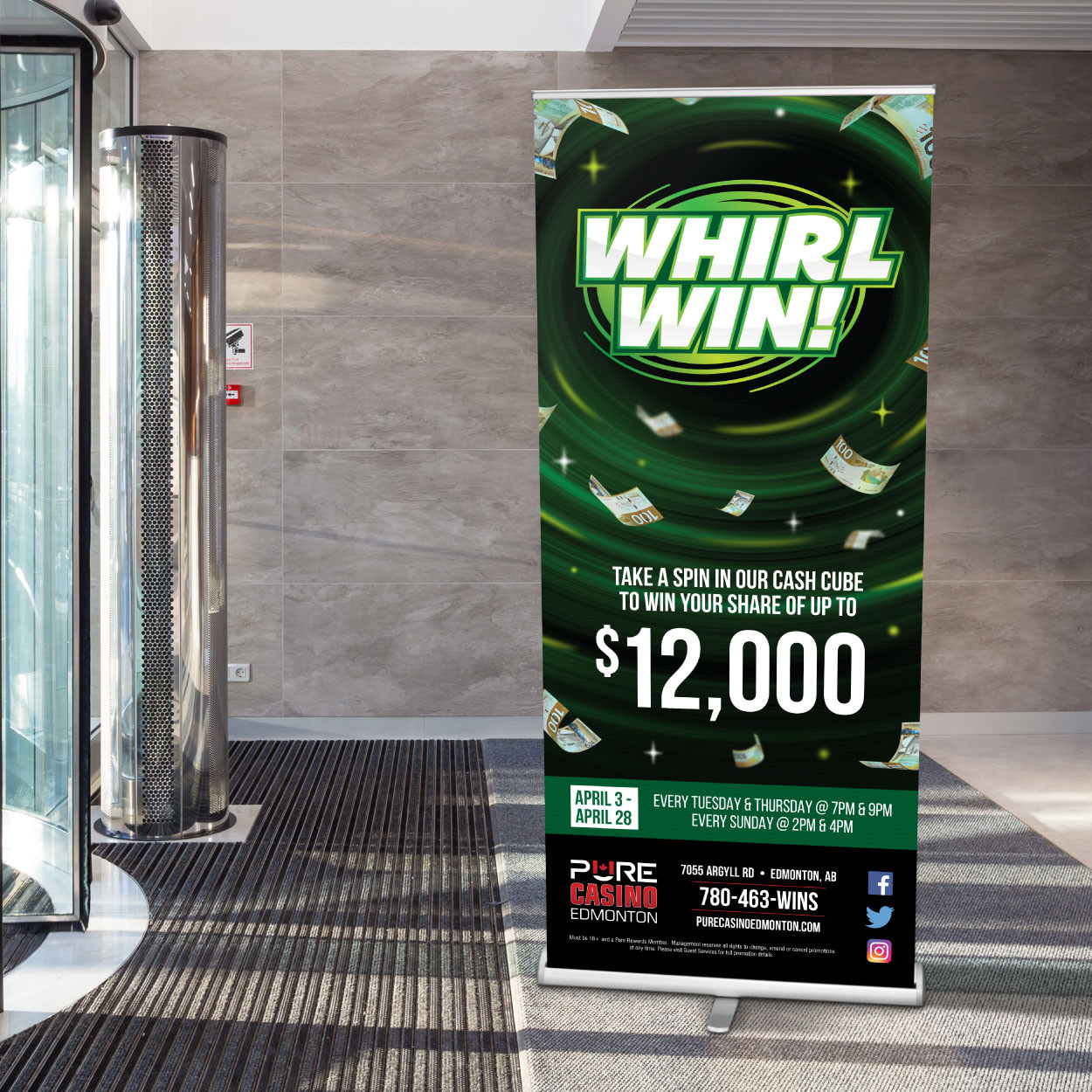
Built as a fully modular toolkit, the campaign was deployed across more than 15 unique guest touchpoints from large-scale outdoor billboards and exterior signage, to in-house digital screens and promotional print collateral. Every asset maintained tight visual cohesion while adapting effortlessly to disparate aspect ratios and lighting environments, ensuring maximum promotional reach.



The Results
The Whirl Win campaign proved so successful on the floor that leadership rolled it out across multiple properties. Designed to easily adapt to any venue layout, print piece, or digital screen, the visual system became a proven performer that was brought back for several promotional cycles.